Case study: Design a responsive e-commerce site
The challenge: To create a concept e-commerce site for local business, Decade Gift Store.
The business: Decade, a 21-year-old gift shop located in a popular Denver, CO, arts district.
What is Decade? An eclectic store carrying a wide range of home decor, knickknacks, mens’s and women’s clothing, jewelry, baby items, greeting cards and more. Many customers visit to see what is new and enjoy the store’s displays arranged by theme. One pain point expressed, however, was that it is sometimes difficult to find specific items across the store.
Timeframe/tools
Three-week Agile sprint consisting of research, wireframing, low-fidelity prototypes up to high-fidelity mockups
Sketch
InVision
Zeplin
Whimsical
Xtensio
Pen and paper

The goal: To translate the in-store experience online, but simplifying the shopping experience so that users can navigate the website quickly and efficiently. Instead of a chaotic and busy layout, I wanted to design an organized and intuitive website.
Final product: High-fidelity mockup of an organized, functional, and attractive e-commerce website where customers can easily find and purchase what they are looking for.

Entry page to Decade’s e-commerce website.
Research: I conducted user interviews and employee interviews; practiced contextual inquiry at Decade to observe how people shopped; compared similar gift stores’ websites for competitor analysis; then created personas, user flows, and a site map.
Some findings…
While interviewing users, I found that many customers loved the store’s visual appeal in its thematic display, some calling it their favorite store. Customers said it’s a great store to browse and to get gift ideas, but conversely that it can be hard to track down specific items.
Currently, there are no products sold through Decade’s website.
Personas: Two personas were developed based off user interviews using Xtensio. One is the more casual shopper looking to browse the site and see what products pique their interest. The other is a more focused shopper set on finding and purchasing specific items without wasting time.
Personas

Janice, a casual shopper.
• Janice is financially comfortable and likes to browse. She will buy something for an event or when she could use an addition to her home.
• Decade is a destination she visits every couple of months because she enjoys the store’s visual aesthetic and products available.
• Open to browsing whatever is in store.

Jillian, a focused shopper.
• Jillian, a student in her early 20s, comes to Decade when she needs to buy a gift and has something specific in mind.
• She likes the brands and products Decade carries and feels confident she can find the right gift while staying within her budget.
• Jillian wants to find what she needs quickly without wasting a lot of time.
User flows, site map and competitor analysis: Next, I mapped out the user flows of each respective persona to navigate through the e-commerce site using Whimsical. Creating the personas for Janice and Jillian helped to inform what each user might prioritize as well as what features were universally important. The goal was not to bombard users with unnecessary pages or information - simple and sleek is best.


Wireframing and prototyping: There were many iterations in Sketch before arriving at my final prototype. Prior to thinking about a color palette and overall aesthetic, I sketched out some ideas to highlight the most crucial information architecture of the site. I started at a lower fidelity prototype to ideate on layout organization possibilities.
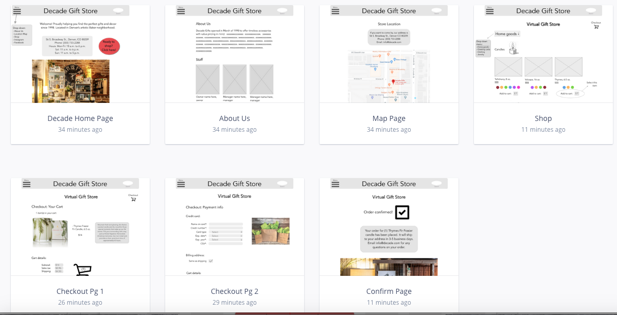
Early iteration of wireframes for e-commerce site shown in InVision.
Iterations: I conducted usability testing to the site’s flow and started making tweaks to the design, focusing on a more seamless and intuitive user flow for each customer. Users expressed that it could be overwhelming when there was too much information crammed into any single page.
Responsive web design: The next step was transitioning to a responsive design, starting with mobile and expanding to a desktop design. At this point, I considered the aesthetic and feel of the existing store and strived to translate that into a fluid online experience.
Phase two


Transferring store brand online: Above are images of the brick-and-mortar store, giving a feel for Decade’s personality and aesthetic. I sought to translate their in-store appeal to a website that matched it, while allowing users to search for exactly what they wanted.

High-fidelity prototype of responsive site for mobile to desktop.

Responsive design lessons: Moving into the responsive design phase, I honed in on atomic design techniques to make the most essential elements of the mobile design stand out in the desktop version.


More iteration: After more user testing, I condensed content on the Product Description Page to only include the most important info. The goal was to make the process as simple for the user as possible while showing the information needed to make a purchase or bookmark for later.

Product description page featuring a store product.
Reflections: After several rounds of conducting research, sketching and wireframing, ideating and prototyping, the final mockup was designed to provide each user with an online shopping experience that was simple, easy, and as enjoyable as visiting the store itself.
My hope was that with a well-designed e-commerce site, Decade can continue to grow and expand its customer base locally and beyond. Customers who enjoy the store but find it difficult to shop in person can find their favorite products online and recommend their family and friends do the same.
With so many retail stores feeling the revenue pain of customers increasingly shopping online, it is more important than ever to have a strong website that will attract more customers to your business. For a store like Decade with a long history and dedicated customer base, merging their in-store success with an attractive, user-friendly online store can only propel their business forward in the future.

Zeplin file
I created symbols to organize my Sketch file and documented typeface and color palettes used in Zeplin before handing off to a development team.